Template talk:P1 areas: Difference between revisions
Greenpickle (talk | contribs) No edit summary |
Greenpickle (talk | contribs) mNo edit summary |
||
| Line 38: | Line 38: | ||
:::::Ok. I'd hate to be a pain, but that "each of the 4 areas separate" really intrigued me. You mean that the game shows each area (on the map) as a different texture? That sure is pointless. And if that's what happens, what's the background behind the areas? '''{''[[User:Espyo|Espyo]]''<sup>[[User talk:Espyo|T]]</sup>}''' 16:39, 22 October 2010 (EDT) | :::::Ok. I'd hate to be a pain, but that "each of the 4 areas separate" really intrigued me. You mean that the game shows each area (on the map) as a different texture? That sure is pointless. And if that's what happens, what's the background behind the areas? '''{''[[User:Espyo|Espyo]]''<sup>[[User talk:Espyo|T]]</sup>}''' 16:39, 22 October 2010 (EDT) | ||
::::::Transparency. Source images are all [http://www.vortiginous.com/miles/pikmin/data/map/ here]; PNG versions and complete maps [http://stuff. | ::::::Transparency. Source images are all [http://www.vortiginous.com/miles/pikmin/data/map/ here]; PNG versions and complete maps [http://stuff.i-know-nothing.co.cc/Pikmin/map/ here] (don't expect these to stay around forever). <span style="font-family:times;">'''''[[User:Greenpickle|<span style="color:#080;">G</span>]][[User talk:Greenpickle|<span style="color:#050;">P</span>]]'''''</span> | ||
Revision as of 08:23, November 6, 2011
Gamefreak75 discussed a good idea on Talk:Areas#Nav Map, so I decided to add it to this template. I didn't complete it because I haven't played Pikmin 2 yet, so there's no way I'm going to make a map of it. Someone that has a ROM for it can get the texture used on the world map (if there is one) with Dolphin (the emulator), and create an imagemap. Well, while that isn't done, this template is incomplete and is making our pages look ugly, so hop to it! {EspyoT} 14:47, 17 October 2010 (EDT)
- ...For a template that's on multiple pages, it's nice to put up a draft without just breaking it like that, and get it finished and approved, then put in place. I'll fix this in a bit... GP
- Well, Miles found it, but it's in bits, at different scales, and the effects (light, fog) appear to be added dynamically. I'm trying to reconstruct it... I think the Pikmin 1 image should have some sort of visual indication on it where the links are, otherwise it's guesswork. Just something like the little markers you see in-game. This is one from Pikmin 2. GP
- Oh, btw, I noticed that Pikmin's map is a bit incomplete too. Like it was said above, it's a bit hard to identify each area. I'll add those markers that are seen on the area selection screen, so the areas are easier to identify. {EspyoT} 08:02, 21 October 2010 (EDT)
- Facepalm. I don't know why I didn't discuss that on this page, GP. Oh well. I'm not sure if it's best to make both images have lightning, or neither of them. I tried a more "mere atlas" approach, and you tried a "familiar image" approach. Or something. {EspyoT} 17:31, 21 October 2010 (EDT)
Hehe, the template ended up excellent! Great work everybody. There are only 2 small things that can be improved. Pikmin's map and Pikmin 2's map have different heights, and that looks slightly ugly in the template. The second thing has been discussed previously: Either add sunlight from the top-left corner to both images, or to neither. {EspyoT} 09:23, 22 October 2010 (EDT)
- Well, upload a version of 1 with light so I can see what it looks like. To get the same heights, we could resize either or crop 1/uncrop 2 (that is, undo the cropping I did). I think it would be nice to have the same image widths too, and wider (as wide as 2 is ATM) would waste less space and probably be more aesthetically pleasing, so you could try cropping 1 to the right height (411px). GP
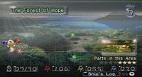
- Will do. In that case, I'll restore the original map, and upload a new image all together, leaving one file for the original texture, and another for the navbox-adjusted picture. Also, a bit off-topic, but something interesting regardless. In the middle of the textures, I found this: [2]. It looks like a mere spotlight. However, the odd part is that it's in a place where one would NEVER think it would be. Take the image on the right. See that black part on the bottom, where "[Ship's Log] · · (+)" is written? The texture is the fully black background of that bar. It doesn't make any sense, but it's true. {EspyoT} 15:24, 22 October 2010 (EDT)
- Ok, turns out I CAN'T do it. The texture is there, all right, but it's rather small. I'd have to resize it to make it look like it is in the game, but I don't know the correct size. No offense, GP, but I guess it's best to make both maps just the texture (i.e. sunshineless). Besides, Vol also thinks the sunlight is a bit out of place. {EspyoT} 15:33, 22 October 2010 (EDT)
